Modal
In human-centered design, when we speak about a modal (or modality), we often refer to a set of techniques, aimed at bringing user attention to a specific event / screen / action / etc. Those often require user input. A pop-up on a website, a file deletion confirmation dialogue on your computer, or an alert asking you to enable location service on your phone - these can all be considered modals.
A modal is a term used in native iOS world (full description here), while on Android, dialogs are often used to create similar or identical behavior, alongside other techniques.
Presenting modals#
Modal can be displayed by invoking the Navigation.showModal() command, as shown in the example below:
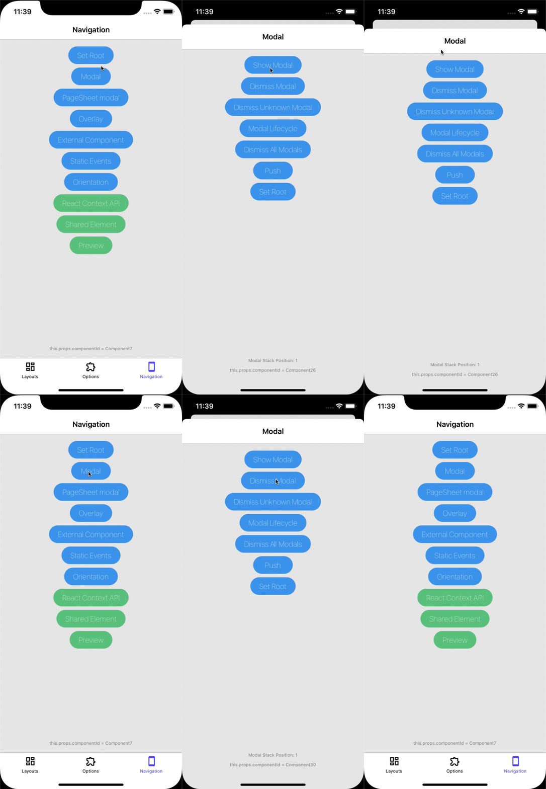
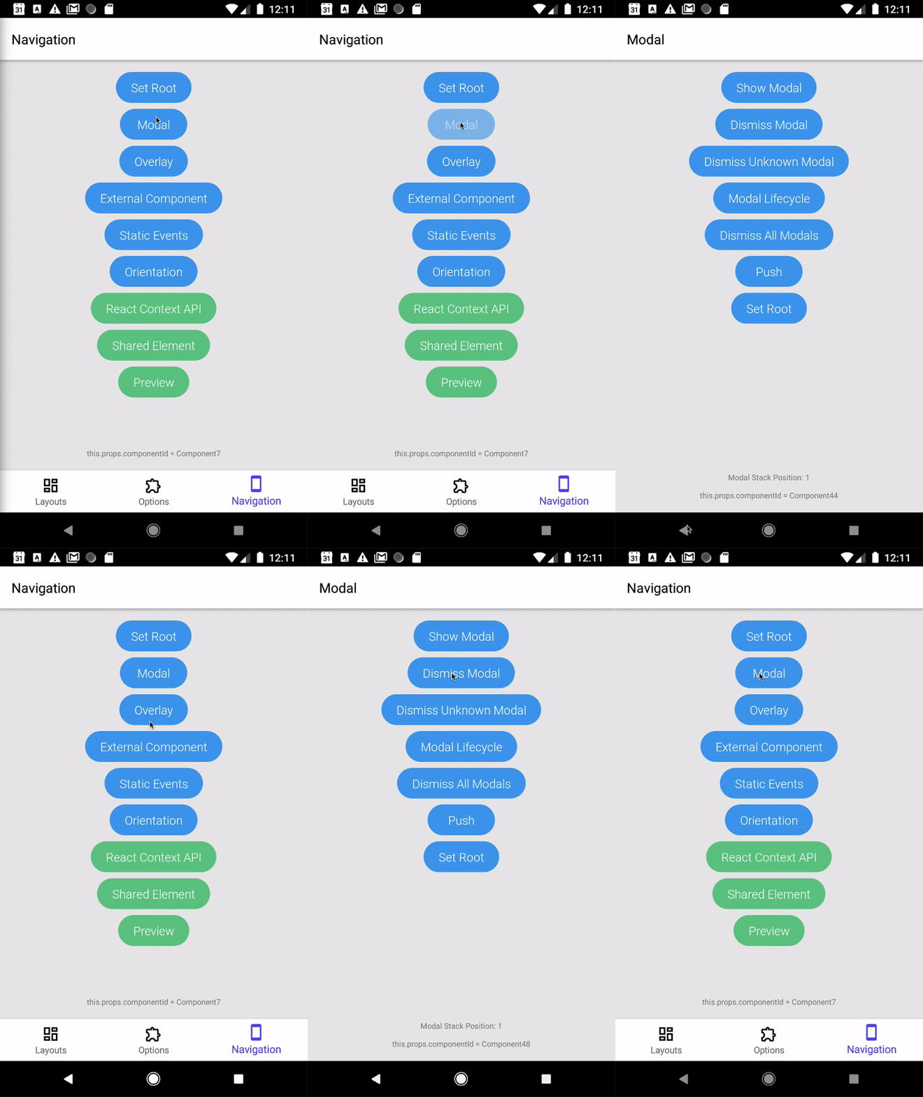
Here's how the Modal looks on both platforms.
- iOS
- Android


Adding a dismiss button#
Modals should always have a dismiss button, on left-to-right devices it's typically placed as a left button in the TopBar.
After we've added our dismiss button, we need to dismiss the modal when the button is pressed.
note
For the LeftButton to be visible, the screen must be displayed in a Stack.
Transparent modals#
Showing transparent modals is a nice technique to increase immersiveness while keeping the user in the same context. When a modal is displayed the content behind it (either root or modal) is removed from hierarchy. While this behavior improves performance, it's undesired when showing transparent modals as we need to see the content behind it.
To configure this behaviour, we'll need to change the modalPresentationStyle option to overCurrentContext and change the layout background color to 'transparent'.
Preventing a Modal from being dismissed#
Preventing a modal from being dismissed is done differently for each platform. While preventing the user from dismissing the modal is possible,
the modal could still be dismissed programmatically by calling Navigation.dismissModal()
If the modal has a dismiss button, of course you'll need to handle it your self and avoid calling Navigation.dismissModal()
when the button is pressed.
Android#
On Android, modals can be dismissed with the hardware back button. You can handle the back press yourself by
disabling the hardware back button dismissModalOnPress option:
As a result, pressing the hardware back button will not dismiss the modal and will dispatch navigationButtonPress event with the default hardware back button id RNN.hardwareBackButton.
iOS#
While iOS devices don't have a hardware back button, PageSheet modals can be dismissed by swipe gesture from the top of the screen. To disable it, set swipeToDismiss option to false.
Presentation Style#
The presentation style determines the look and feel of a screen displayed as modal.