Overlay
Overlays are used to layout content on top of all other layout hierarchies, while fitting the screen bounds. The contents displayed in an Overlay can either be non-obtrusive, like Toasts and Snackbars, or an Alert that blocks all interactions with any content behind it. The view contained within it should be aligned either with absolute position, flex, or with margins, all according to your needs.
Handling touch events outside the view#
When showing views like Alert or Toast in an Overlay, you would want to configure if you want to allow users to interact with content behind the alert. This is done via the interceptTouchOutside option.
Overlay examples#
- Alert
- Toast
- Tooltip
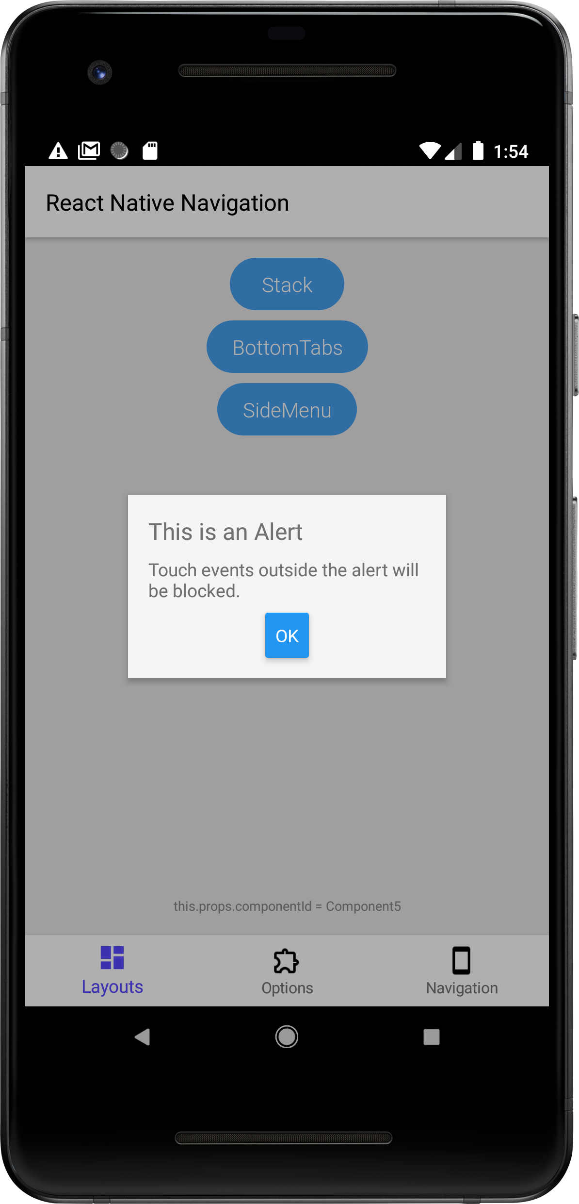
The example below demonstrates how to create a simple alert dialog using an Overlay. Touch events outside the alert will be blocked and won't pass through to the content behind the alert since we're specifying interceptTouchOutside: true in the static options of the Alert.

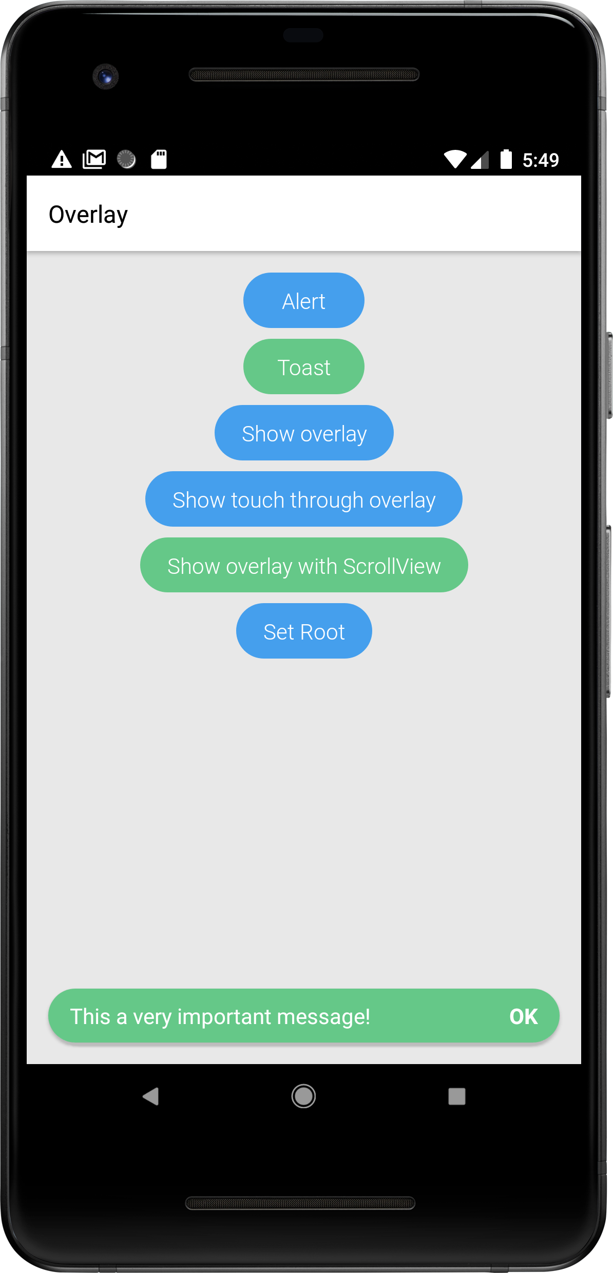
The example below demonstrates how to show a Toast using an Overlay. A user can interact with the content behind the toast since we've declared interceptTouchOutside: false in the static options of the Alert.

The example below demonstrates how to create a tooltip, (Attached overlay) using the Overlay API.
The component will be anchored to anchorId in a layerId level, at gravity side of the anchor, see.
You can use the returned id inorder to maintain the tooltip state, show/hide.
