Animations
Various UI elements can be animated by declaring animation options. You can change the default animations for various commands, like push and pop, and even animate elements in your screens during screen transitions.
Animation properties#
The following properties can be animated with our animation framework:
- x - Translate the view to a coordinate along the x axis.
- y - Translate the view to a coordinate along the y axis.
- translationX - Translate the view along the x axis relative to its current x position.
- translationY - Translate the view along the y axis relative to its current y position.
- alpha - Apply alpha animation to the view. A value of 0 means the view is not visible, 1 means it's visible.
- scaleX - Scale the view on the x axis. A value of 1 means that no scaling is applied.
- scaleY - Scale the view on the y axis. A value of 1 means that no scaling is applied.
- rotationX - Applies rotation around the x axis (in degrees, passed as a float).
- rotationY - Applies rotation around the y axis (in degrees, passed as a float).
- rotation - Rotates the view on all axis. Positive values result in clockwise rotation.
Layout animations#
Root animations#
Animating switches between roots, using the enter/exit animations that grants control on how each root is animated when entering or exiting the screen.
This can be acheived by modifying the default options (setDefaultOptions for example) to be like:
In Playground, you can try it by setting useCustomAnimations in flags.ts file.
Stack animations#
When animating screens in and out of a stack, there are three elements you can work with:
- content - screen being pushed or popped
- topBar - stack's TopBar
- bottomTabs - if stack is a child of a bottomTabs layout, we can control the
hideandshowanimations of the bottomTabs.
The following example demonstrates how to replace the default push and pop animations with slide animations.
- Push
- Pop
Modal animations#
Modal animations are declared similarly to stack animations, only this time we animate the entire view and not only part of the UI (content). The appearing modal can play custom enter animation and exit for the disappearing screen when showing/dismissing modal.
- Show
- Dismiss
The following example demonstrates how to show a modal with a fade-in animation.
Deprecation warning
Consider using enter, exit animations instead.
The following example demonstrates how to dismiss a modal with a fade-out animation.
Deprecation warning
Consider using enter, exit animations instead.
Shared element transitions#
Shared element transitions allow us to provide visual continuity when navigating between destinations. This also focuses user attention on a particular significant element, which then also gives such user better context when transitioning to some other destination.
caution
At the moment, the transition is available for push and pop commands. We are working on expanding supported commands to show/dismiss modal and change BottomTabs.
Transition breakdown#
Let's take a more in-depth look at the following example, which you can find in the playground app:
Source screen and the Destination screen
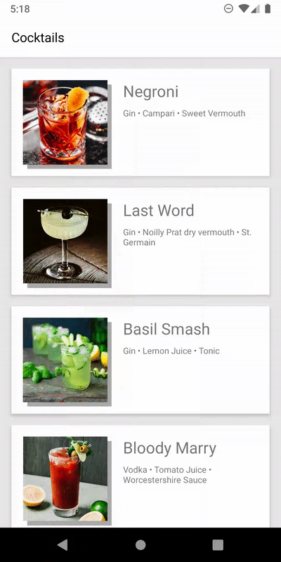
Four elements are animated in this example. Let's list the elements involved in the transition and note which properties are being animated.
image - the item image is animated to the next screen.
- image scale (resizeMode)
- position on screen
image background - each item has a "shadow" view which transitions to the next screen and turns into a colorful header.
- scale
- position on screen
- color
title - the title of the item is animated to the next screen.
- font size
- font color
- position on screen
Description - the description of the item in the destination screen.
- fade-in
- translation y
Implementing shared element transitions#
Step 1 - set a nativeID prop to elements in the source screen#
In order for RNN to be able to detect the corresponding native views of the elements,
each element must include a unique nativeID prop.
Step 2 - set a nativeID prop to elements in the destination screen#
Step 3 - Declare the shared element animation when pushing the screen#
The interpolation property is an object which consists of a type property, and optional parameters to further configure the interpolation function. The following types are supported:
'accelerate': Begin building up speed until destination has been reached.factor: The acceleration factor. Higher values look faster.
'decelerate': Start at a high speed and slow down to settle.factor: The acceleration factor. Higher values look slower.
'accelerateDecelerate': Begin building up speed until half of the animation is complete, then begin slowing down to settle.'decelerateAccelerate': Start at a high speed and slow down until half of the animation is complete, then speed up again to settle.'linear': Linearly move towards the destination.'overshoot': Begin building up speed and overshoot the destination, then fling back to settle.tension: The tension of the overshoot animation defines how far the object can overshoot. Default:1
'spring': Acts like an actual spring. Depending on the configuration, this interpolation can overshoot the destination multiple times, or be very stiff and smoothly ease towards the destination.mass: The mass defines how "heavy" the object is. Default:3damping: The damping property specifies how much the moving object is being slowed down. Higher values can lead to overdamping, lower values to underdamping. Default:500stiffness: The stiffness property defines how stiff the animated object is. Default:200
caution
Since a Spring interpolation is not a time based animation, you have to manually tweak the configuration to match the duration of the animation, otherwise the remaining time of the Spring interpolation will get skipped.
Element Transitions#
Element transitions also allow you to animate elements during shared element transitions.
Recreating#
Step 1 - Set a nativeID prop to the element you'd like to animate#
An element can either be in the source or destination screen.
Step 2 - Declare the element animation when pushing the screen#
Peek and Pop (iOS 11.4+)#
react-native-navigation supports Peek and pop feature in iOS 11.4 and newer.
This works by passing a ref to a component you want to transform into peek view. We have included a handy component to handle all the touches and ref for you:
All options except for reactTag are optional. Actions trigger the same event as navigation button presses. To react when a preview is committed, listen to the previewCompleted event.