SliderSliders allow users to make selections from a range of values in a quick and interactive way.
Sliders reflect a range of values along a bar, from which users may select a single value. They are ideal for adjusting settings such as volume, brightness, or applying image filters.
- Overview
- Dev
Usage examplesSliders can be used for various types of user input and controls, for example an amount, or a specific setting.

Slider types
| Slider type | Preview |
|---|---|
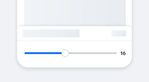
| Linear slider Use this slider to allow the user to select a numeric value from a range of numbers. |  |
| Centered slider This type allows the user to select negative values. |  |
| Range slider Use this slider to allow the user to select a range of values. |  |
| Color slider Use this slider to allow the user to select a color from a gradient range of colors. |  |
Spec
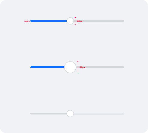
Linear slider
Default
Thumb: 24px
Outline: 1.5px
On tap Thumb: 40px Outline: 1.5px
Disabled
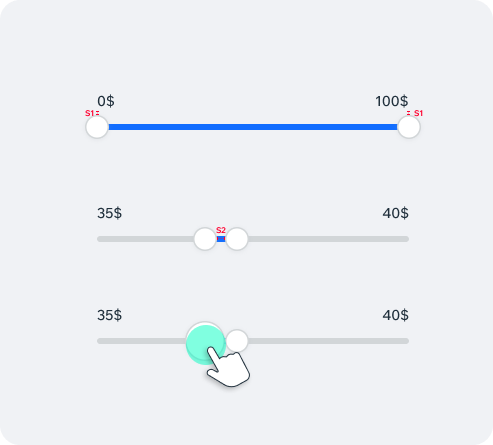
Range slider
Initial state Widest range is displayed by default.
Thumbs Thumbs should not cross each other and keep minimum distance between them of S2 (8px). Thumbs shouldn’t overlap each other when idle.
Spacing Minimum spacing between idle Thumbs - S2
UsageCode Example
<Incubator.Slider
  value={0}
  minimumValue={0}
  maximumValue={10}
  onValueChange={value => console.log(\`value changed: \${value}\`)}
/>
APIThis is the list of additional props for the component