ButtonA button triggers an event or action.
Primary buttons that indicate a call to action, are the most prominent. Secondary buttons, which indicate less commonly used actions, should be less prominent than primary buttons, second in hierarchy.
Buttons are placed where a user should expect them, i.e. in close proximity to the other elements that the action affects.

- Overview
- UX Guidelines
- Dev
Button TypesButtons are available in different types, each designed for specific actions and purposes.
| Type | Component |
|---|---|
| Main Button The default button style, used for most actions. |  |
| Icon Button Icon buttons are round buttons without a text label. |  |
| Link Button Link buttons are typically used for minor actions. |  |
| Full-Width Button Full Width buttons are sticky on the bottom of the screens. |  |
Button
Main
| Property | Default | Outline |
|---|---|---|
| Active |  |  |
| Disabled |  |  |
Sizes
| Property | Component |
|---|---|
| Large |  |
| Medium |  |
| Small |  |
Accessories
| Property | Component |
|---|---|
| Icon prefix |  |
| Icon suffix |  |
Icon ButtonIcon buttons are round buttons without a text label.
Priority
| Property | Component |
|---|---|
| Default |  |
| Outline |  |
States
Main
| Property | Default | Outline |
|---|---|---|
| Active |  |  |
| Disabled |  |  |
Usage Examples

Link ButtonLink buttons are typically used for a somewhat minor actions.
Presets
| Property | Component |
|---|---|
| Main text style: bodyBold, $textPrimary |  |
| Disabled text style: bodyBold, $textDisabled |  |
Sizes
| Property | Component |
|---|---|
| Regular Default |  |
| Small |  |
Accessories
| Property | Regular | Small (bodyBoldSmall) |
|---|---|---|
| Icon prefix |  |  |
| Icon suffix |  | |
Full-Width ButtonFull-Width buttons are sticky on the bottom of the screens.They are usually used for primary actions on management screens, e.g. adding a new item to a list.
They are great to use on screens with potentially long lists, since they stick to the bottom and are always visible.
Presets
| Property | Component |
|---|---|
| Main |  |
States
| Property | Component |
|---|---|
| Active |  |
| Disabled |  |
Usage Examples

Do’s & Don'tsThere are a few things to avoid when implementing buttons in your screen:
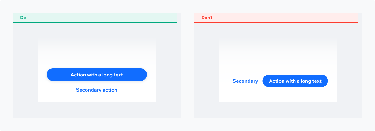
Unclear buttons hierarchyHave a clear hierarchy of your buttons. Decide which one of the actions in your screen is the main one and use a Primary button for it. All other buttons should be secondary and tertiary in the way they look. Destructive actions should be treated likewise.

Inappropriate buttons layoutMake sure you’re using a layout that can accommodate actions text.
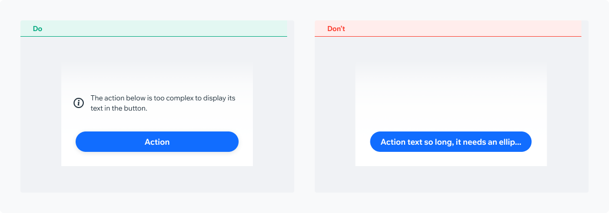
Action text truncation/ellipsisAction text truncation or ellipsis should be avoided at all costs.
Actions should be clear and down to the point. In case the action is complex, consider displaying an explanatory text outside the actual button component.
Full-Width Vs. Floating ButtonSelecting the right button style for your needs
Full Width ButtonMedium prominence. Used in management screens for the main action, e.g. ‘Add New’
Floating ButtonHigh prominence. Used as the main CTA on the screen, e.g. ‘Join Now’, ‘Create’

PlaygroundCode Example
INFO
This component support margin, background modifiers.
TIP
This component extends the basic/TouchableOpacity props.
APIThis is the list of additional props for the component