CarouselThe Carousel component allows users to navigate through a series of content in a linear way by swiping.
- Overview
- Dev
UsageCarousels are useful when you want users to focus on one item at a time, especially with large content sets. They can hint at more content and save space by showing items without cluttering the layout.
It's best to arrange items so the most important ones appear first, making them easy for users to find.
Content Types
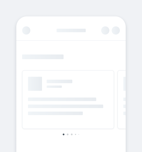
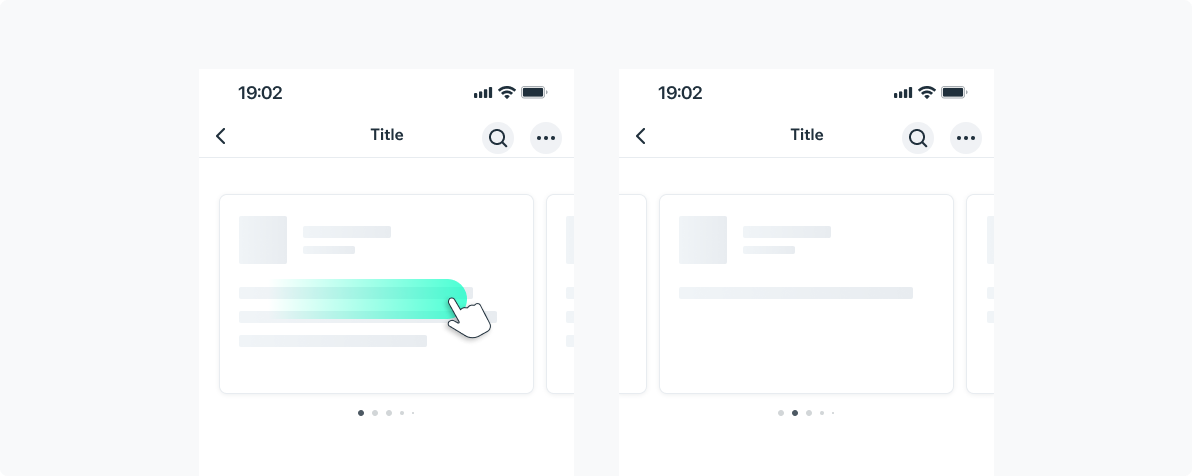
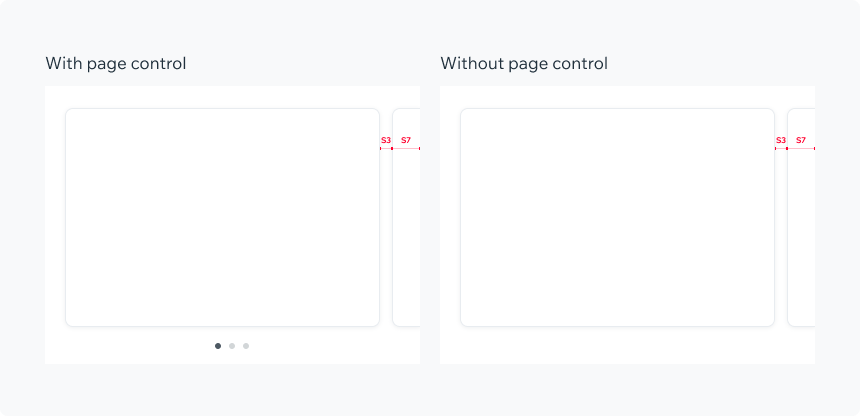
CardsCard widths can adjust based on their content, keeping at least an S7-sized "hint" of the next or previous item visible.
All cards in a single carousel should have the same width, but widths can vary between carousels.
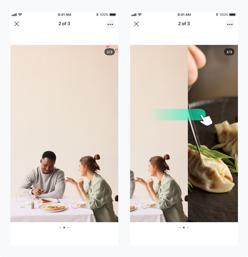
GalleryItem Width: Full width.
Item Height: Adjusts dynamically based on the content.
Spacing: No spacing between items.
Counter: a counter can be displayed to indicate the current slide number and the total number of slides. Upon swiping, the counter remains in place.
Custom ContentYou can use the Carousel with custom content.The spacing between the items of the carousel can be customized.

PlaygroundCode Example
INFO
This component support modifiers.
TIP
This component extends the ScrollView props.
APIThis is the list of additional props for the component