GridListGridList display a collection of GridListItems organized in a repeated grid pattern.
GridList allows users to scan content based on images and compare items within a collection.

- Overview
- Dev
Usage Examples
GridList with Avatars
GridList with MediaItems

Columns Options
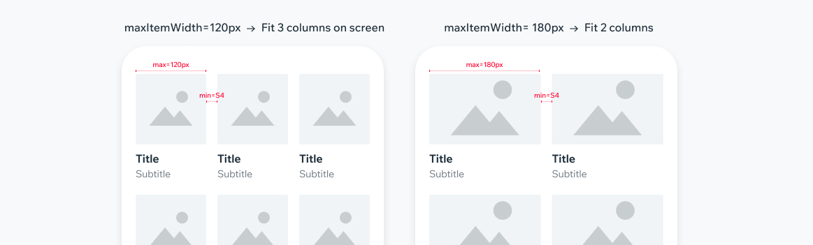
Option 1 - Max Item WidthSet maximum width of a single item, and amount of items in a row will be set automatically according to screen width.
Columns number will be dynamic according to how many items fit the screen.
Option 2 - Column NumberSet amount of columns, and items width will be automatic according to screen width. Columns number will be fixed.

Spec
Spacing between items
Horizontal gutter by default is minimum S4 and can be modified.
Vertical gutter is equal to horizontal gutter.
Last item counter
Once grid reaches Max of items, the last item should get an overlay color and number of remaining items.
The item content shouldn’t be displayed.
This state is available in the MediaItem and Avatar components.

UsageCode Example
<GridList>
 data={items}
 maxItemWidth={140}
 numColumns={2}
 itemSpacing={Spacings.s3}
 listPadding={Spacings.s5}
/>
TIP
This component extends the FlatList props.
APIThis is the list of additional props for the component