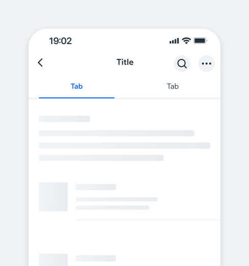
TabControllerTabs organize and navigate between related content groups at the same hierarchy level, helping users easily find different information types.
A Tab Bar can start with 2 tabs and accommodate more, with horizontal scrolling if the tabs exceed the screen width.
- Overview
- UX Guidelines
- Dev
BehaviourTabBar behavior and style are identical in both iOS and Android.
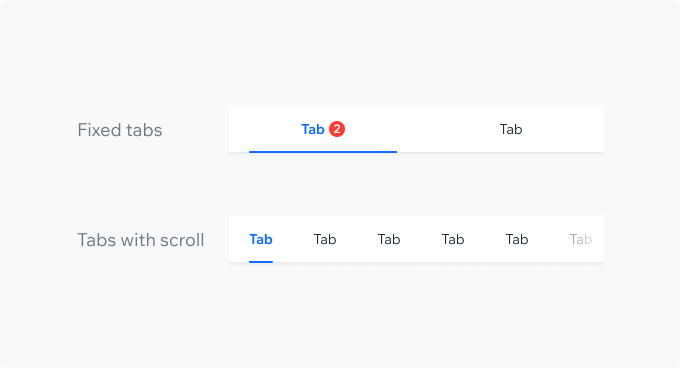
Tabs LayoutFixed tabs usually have 2-3 tabs that fit on the screen without scrolling.
When the total size of the tabs exceeds the screen width (usually more than 3 tabs), a horizontal scroll is implemented.
When scrolling through tabs, add an overlay to indicate more tabs are available off-screen. The overlay should disappear once the first or last tab is reached. It should be the top layer, covering all tab elements, including the indicator and badge.
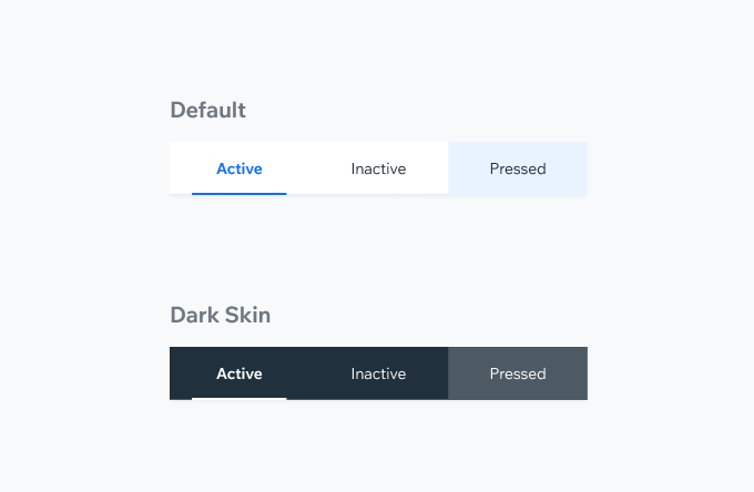
Styling
Inactive Tab Text: BodySmall $textDefault Background: $backgroundElevated
Active Tab Text: BodySmallBold $textPrimary Background: $backgroundElevated Indicator: $outlinePrimary
Shadow sh10
Dark Skin Text: BodySmall, System White Background: System Grey10 Divider: System Grey20
Accessories
| Property | Component |
|---|---|
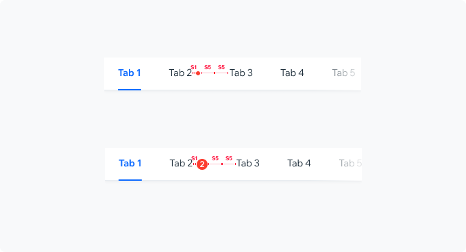
| Counter Badge A Counter Badge can be added to indicate the amount of activity within the tab. |  |
| Pimple Badge A Pimple Badge can be added to a tab to draw the user's attention to activity within it. |  |
| Action Icon Admins can add and edit tabs using an action button that can be added after the last tab. |  |
Spec
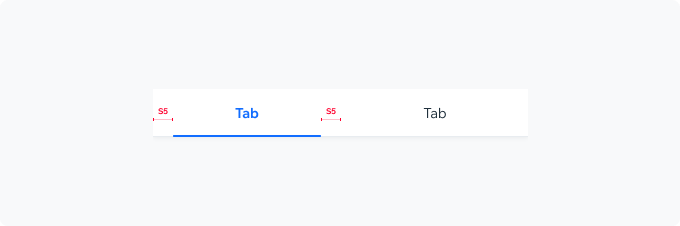
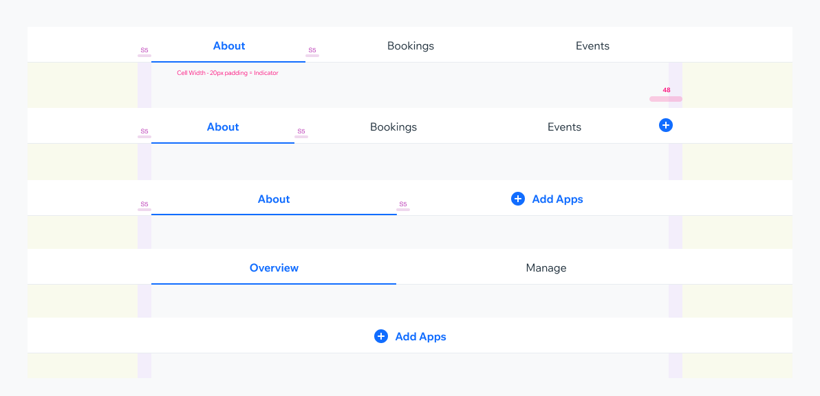
IndicatorIndicator width: cell width minus S5 padding.
Indicator height: 2px
Indicator coloring: $outlinePrimary
Badge Component
Tablet
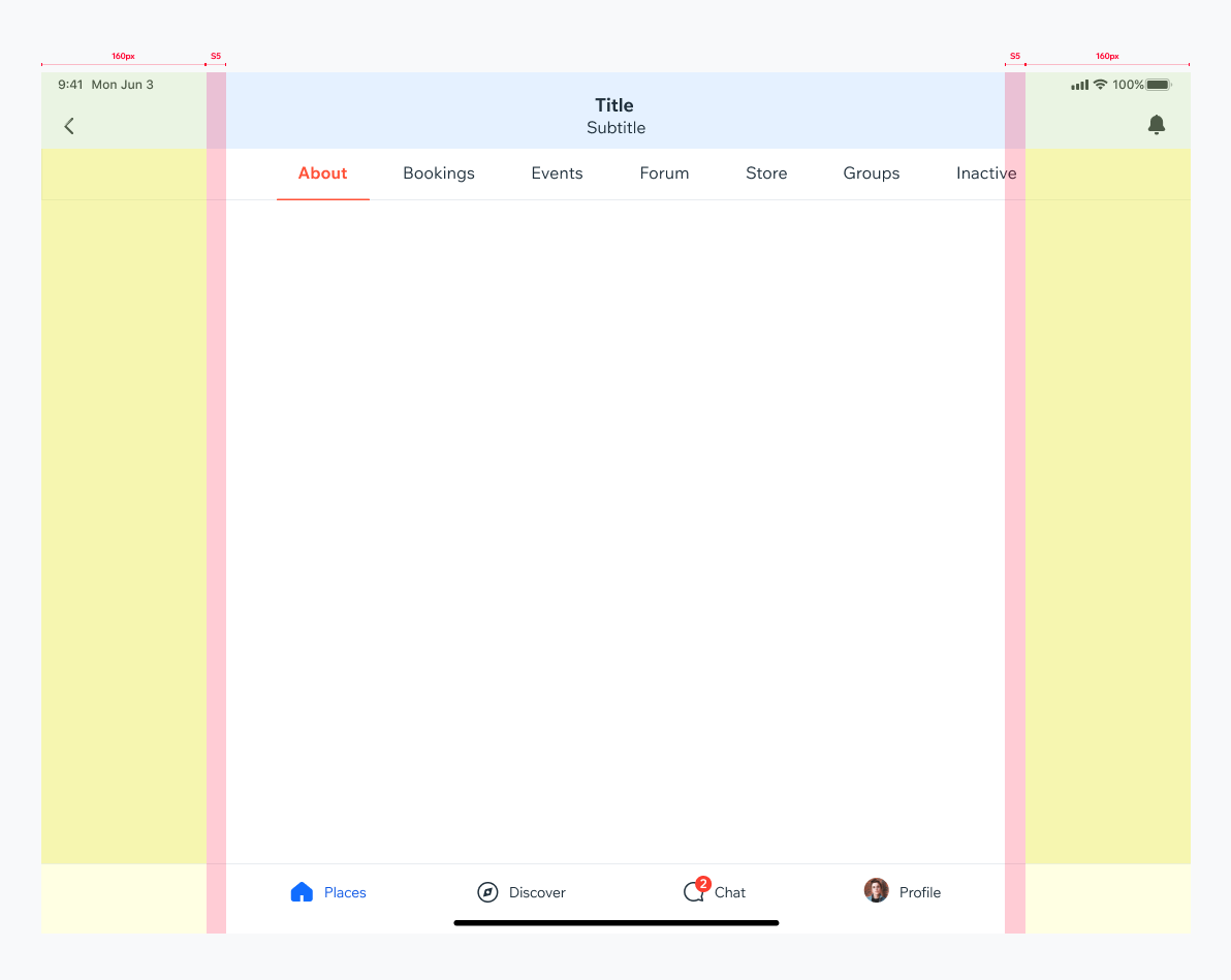
TabBar widthThe TabBar width is full width but the tabs container is aligned with the content.
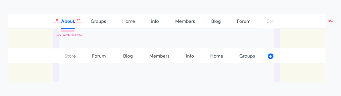
Scrollable TabBarIf the sum of elements is larger than screen width (usually when there’s more than 6 tabs), indicator gets the label Width.
Tab cell minimum width: 70px
Label minimum padding: S7 (28px)
Fixed TabBarUp to 6 tabs can typically fit within the screen width without scrolling.
The indicator gets the cell width with 20px padding
Do’s & Don'ts
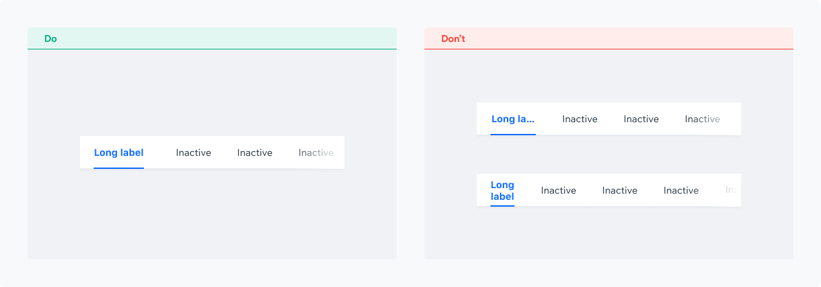
Tab ContentTab text is stretched to fill the tab without line breaks or ellipses.
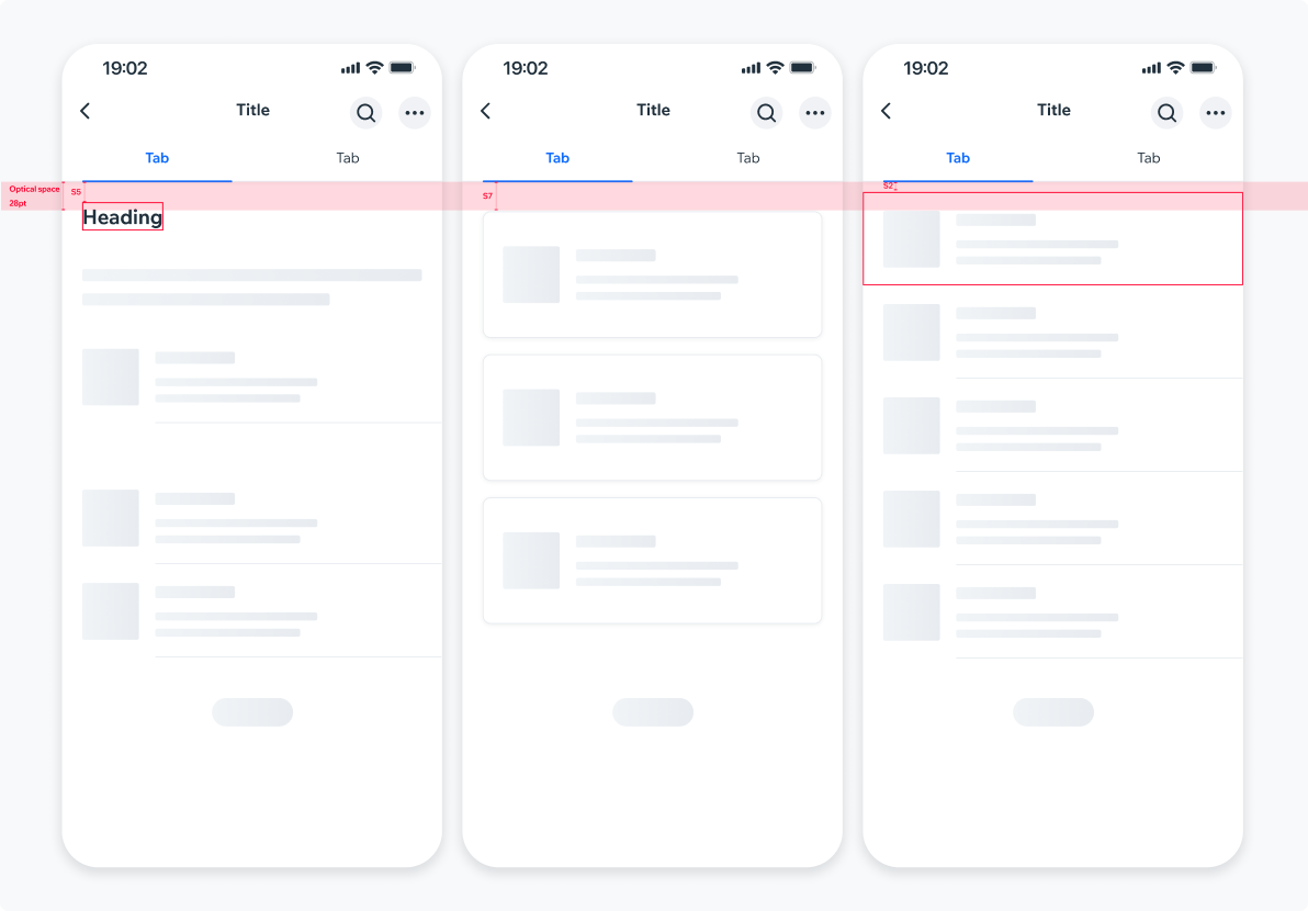
Optical SpacingTo create visual alignment across tabs with different content, create an optical space of 28pt from the TabBar to the content. Actual component spacing is rounded to the nearest spacing preset. For example, the screen heading is placed at 28pt distance from the TabBar, but the actual text container is placed at 20px distance (S5).
UsageCode Example
<TabController items={[{label: 'First'}, {label: 'Second'}, {label: 'Third'}]}>
  <TabController.TabBar enableShadows/>
  <View flex>
    <TabController.TabPage index={0}>{renderFirstPage()}</TabController.TabPage>
    <TabController.TabPage index={1} lazy>{renderSecondPage()}</TabController.TabPage>
    <TabController.TabPage index={2} lazy>{renderThirdPage()}</TabController.TabPage>
  </View>
</TabController>
APIThis is the list of additional props for the component