HintA hint is used to draw the user’s attention to a specific part of the interface, providing information or encouraging them to take action.
Hints are typically triggered automatically at the right moment in the user journey but can also appear in response to user actions.
The hint should disappear when the user taps anywhere on the screen.

- Overview
- Dev
Usage Examples

AlignmentThe Hint component supports different alignments, so it works well with elements anywhere on the screen.
| Alignment | Top | Bottom |
|---|---|---|
| Left |  | 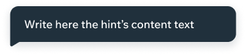 |
| Center |  |  |
| Right |  |  |
Accessories
| Prop | Preview |
|---|---|
| None |  |
| Icon |  |
Position
Distance
Keep a distance of S2 from the component the hint is pointing at.

Spec
The Hint component adjusts to its content.
Max width: screen width, S4 margins.

PlaygroundCode Example
APIThis is the list of additional props for the component