ColorPicker
Picking color for background, typography and other elements is possible by various means, among these are:
Color Swatch, Color Palette and Color Picker Dialog.
All these can be implemented in the color picking flow.
- Overview
- Dev
Usage ExampleIn this example, user picks his own theme color.
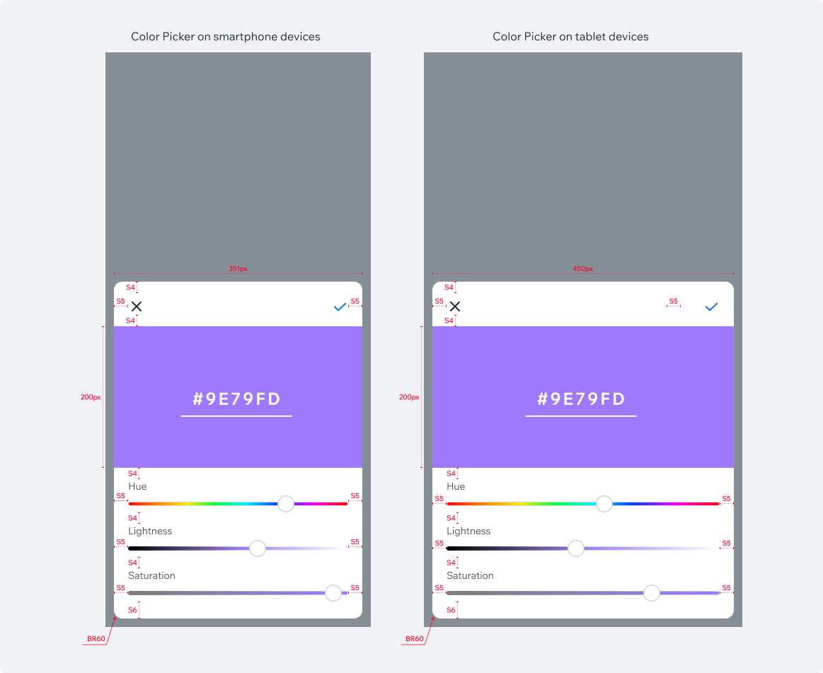
- Tapping 'Add New' in the Color Palette opens a color picker dialog.
- Using HLS controls (or even typing actual HEX value) user can achieve any color.
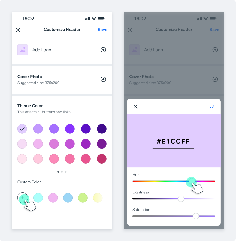
- Changes are saved by tapping on ‘V’.
- New color styles is saved in the Color Palette and selected as the theme color.
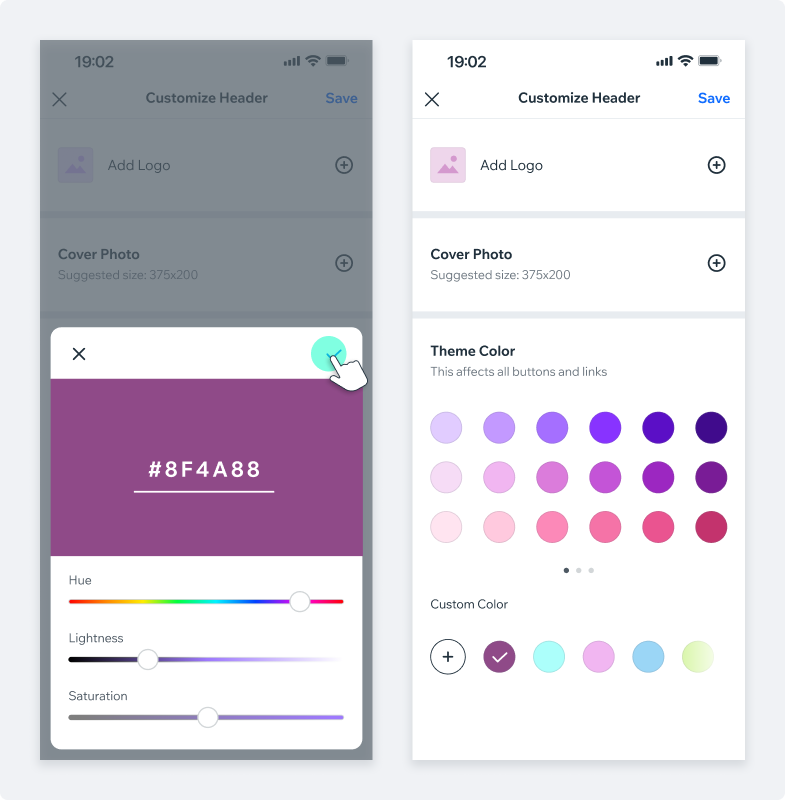
Additional entry points examplesAs mentioned, Color Picker dialog can be triggered by various entry points.
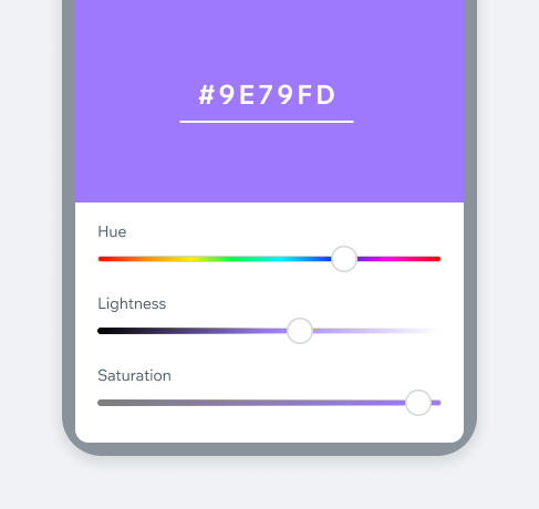
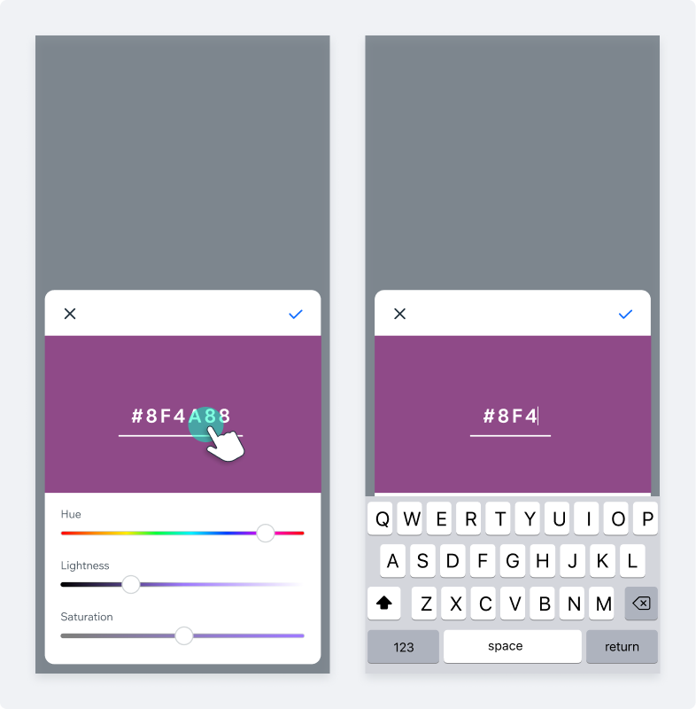
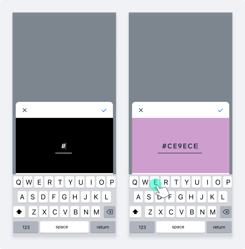
Adding HEX values manuallyColor Picker dialog allows manual entry of the HEX values:
- Tapping on the HEX value will “activate” the input field (Main Input) and display the keyboard. New color can be created either by typing a hex value or by pasting a specific value.
- Until new valid hex value is provided, the initial color background is kept. Hex value is highlighted with either white at 25% or black at 25%, depending on the background color.
- ‘#’ symbol is permanent and cant be deleted.
- Once hex value is valid (6 characters), background color changes accordingly.
Spec
PlaygroundCode Example
APIThis is the list of additional props for the component