PickerPicker allows the user to select an option from a variety of choices available.Pressing the Picker Field, will open a dialog or modal displaying a list of available options for selection.
- Overview
- Dev
Usage ExamplePickers allow selection of an option or multiple options from a list usually displayed using an actionSheet. Pickers can be used in forms, settings screens or as part of an interactive flow.
Picker TypesVarious types of pickers are available to accommodate different needs and use cases.
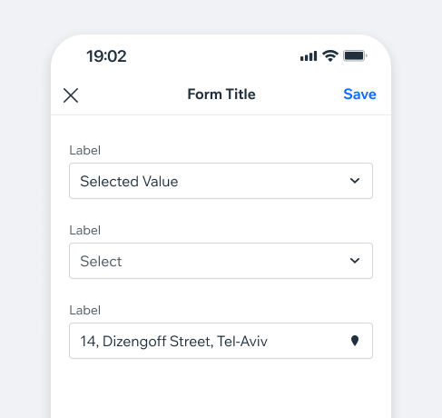
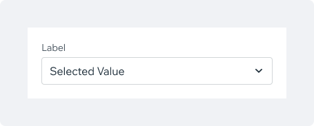
Form Field (default)Mainly used as part of a form, works cohesively with the text field component and other form related components.
Filter FieldUsed mostly for filtering a screen or part of it. Can be combined with search functionality.
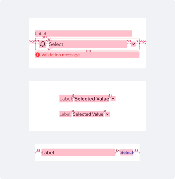
The colon symbol in the Label is not part of the component itself and should be included as part of the text string.

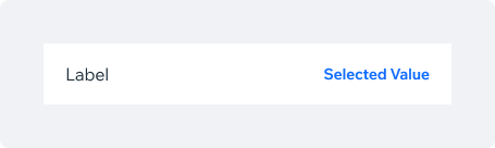
Settings FieldBased on ListItem component.
Used mostly when the picker is part of a settings screen.
Picker Types Examples
Form Field
| State/Type/Preset | Preview |
|---|---|
| Default | |
| Value selected + icon prefix | |
| Disabled | |
| Validation error (value not selected) |
Filter Field
| State/Type/Preset | Preview |
|---|---|
| Default | |
| With label | |
| Multiple values selected |
Settings Field
| State/Type/Preset | Preview |
|---|---|
| Default | |
| Value selected + icon prefix |
Picker Values display optionsThe Picker component serves as an entry point to a list of selectable values, usually displayed in a modal or a dialog.
DialogRecommended for short value lists.
ModalUsed for longer lists like country selection, currency selection or a language picker.
Values displayed in DialogThe Picker component serves as an entry point to a list of selectable values, usually displayed in a modal or a dialog.
Single selectionTapping on an item will select it and close the dialog. In scrollable long lists, the selected item will be displayed at the top of the list to stay visible.
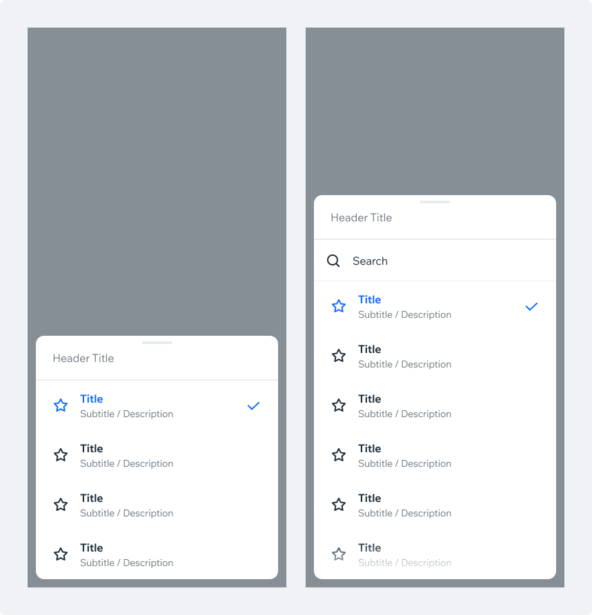
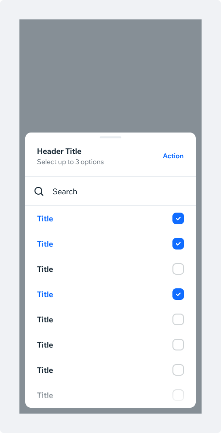
Multi-selectIn multi-select dialogs, a clear CTA for “Done” or “Save” is required to confirm the selection and dismiss the dialog.

Dialog States
Maximum SelectedWhen the user reaches the limited amount of options allowed to select, the non-selected options will become disabled to restrict the user from selecting more options.
Validation Error
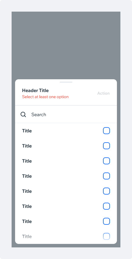
Product can set the minimum amount for the selected options. If the user selects less options than the minimum:
- Display a validation error in the picker header. The error text should explain the user should select at least one option.
- The dialog CTA will become disabled.
- If the user will close the dialog, the changes won’t be saved.
- When the user selects the minimum required options, the validation error will disappear and the CTA will become active.
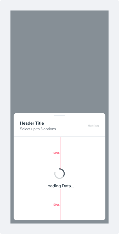
Loading DataIf the data can't be loaded before opening the dialog, a Loader should be shown to let the user know that content is being fetched.
The search input is hidden while loading.
Since the number of items to be loaded is unpredictable, a fixed spacing of 120px below and above the loader has been set.
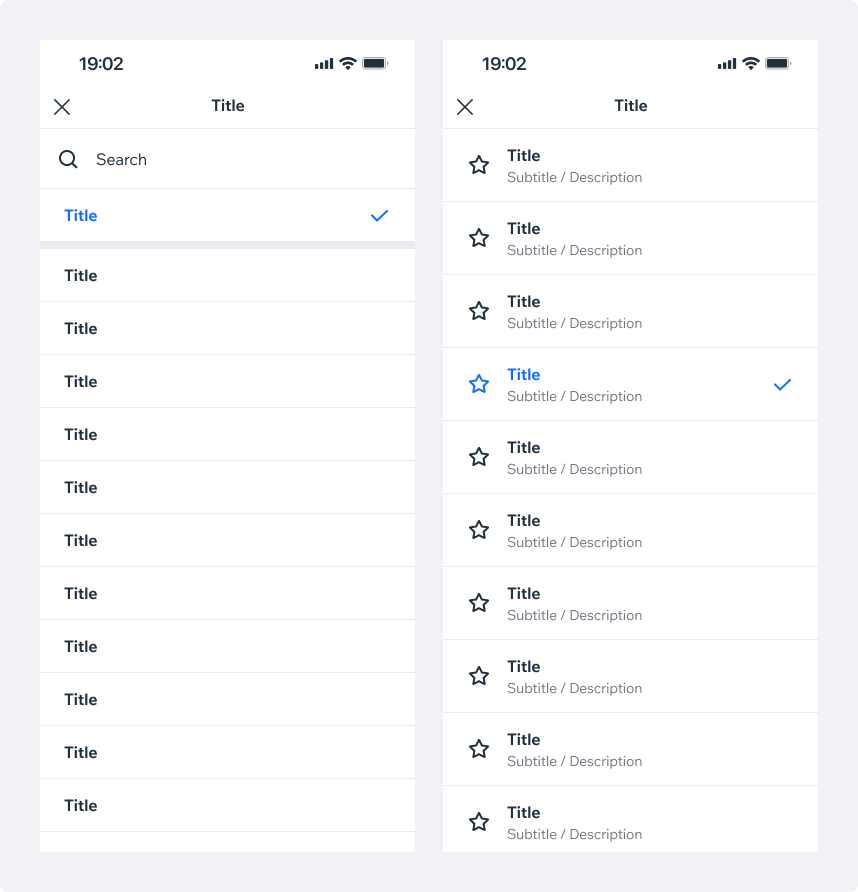
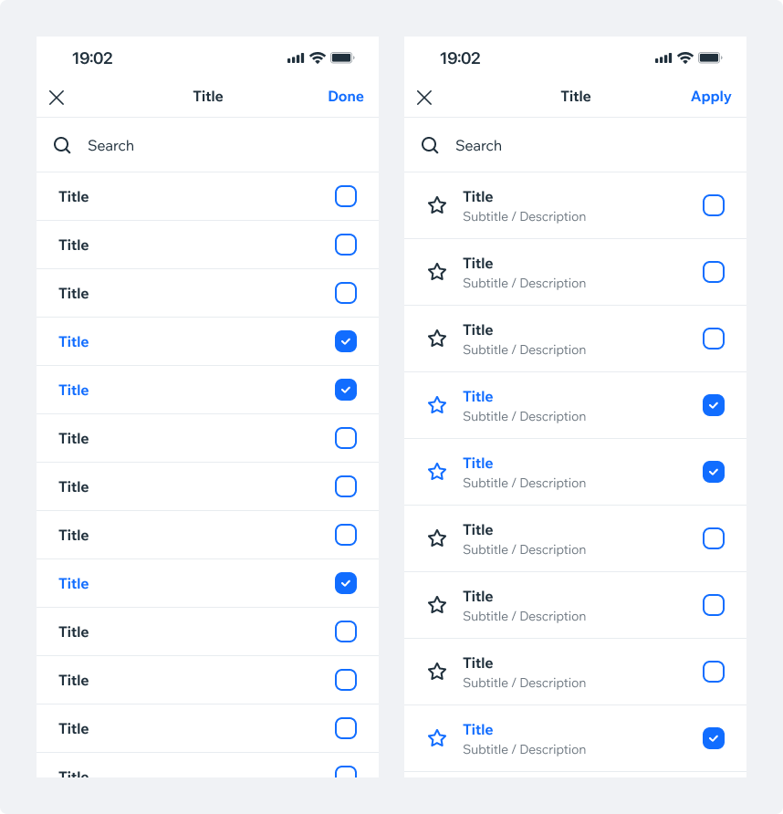
Values displayed in ModalThis type of selection list is used for long lists, e.g. contacts, countries and currencies.
Single selectionTapping on one of the list items will select it and close the modal. The CTA is optional and disabled by default. It can be added in cases where users might not expect or want the modal to auto-dismiss upon selection.
The selected Item is hoisted on top of long lists by default (placed above other values). This can also be set for short lists.
A search bar can be added on top of the values list.
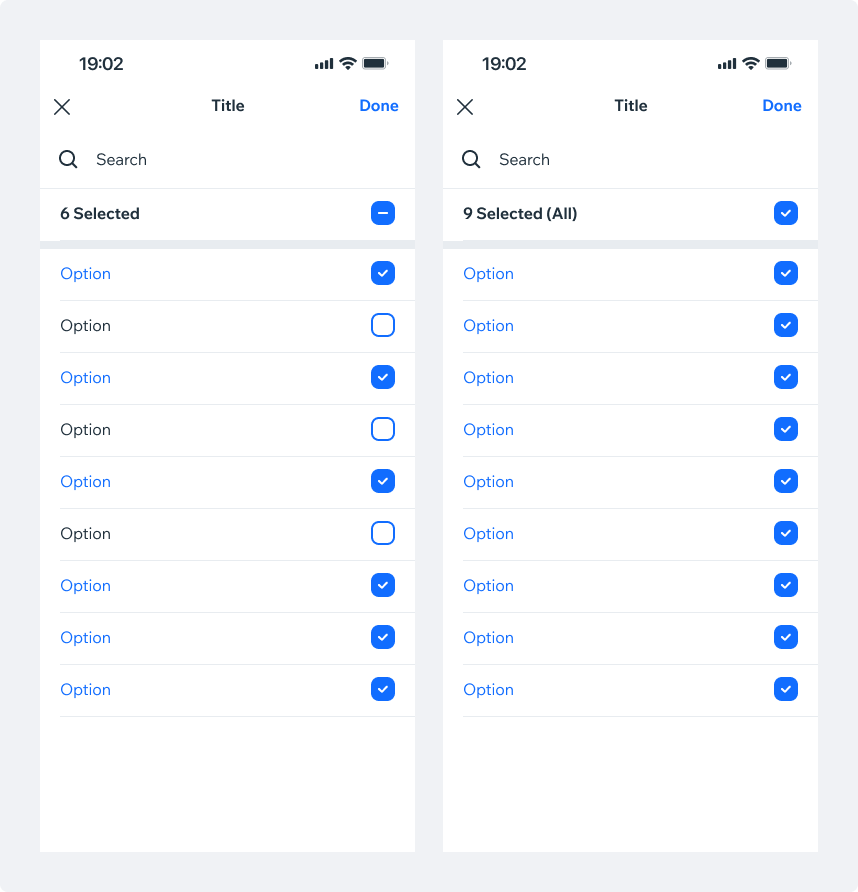
Multi-selectIn multi-selection dialogs, a CTA for “Done” or “Save” is required to confirm the selection and dismiss the modal.
Select allProviding a clear “select all” action is a good practice. In case all items are selected, display a “clear all” action. Make sure items number is clearly displayed according to the selection.
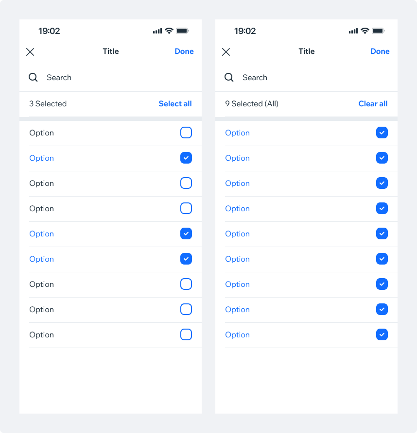
Select all checkboxIn some cases, using checkbox for the “select all” action will be more appropriate. Note that “select all” checkbox can use an “indeterminate” state, if needed.
Make sure that selected items number is clearly displayed.
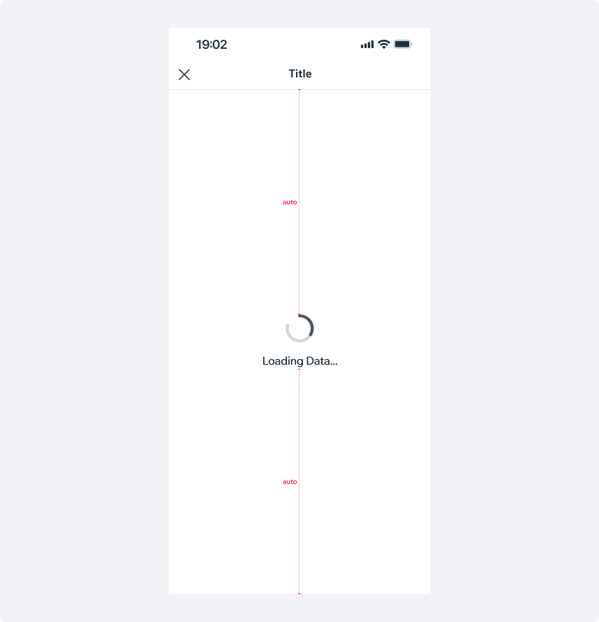
Loading DataIf the data can't be loaded prior to opening the modal, a Loader should be shown, indicating that content is being fetched.
Search input is hidden while loading, and the loader is aligned to the center of the screen.
Picker PresetsPickers allow selection of an option/value or multiple options/values from a list. Pickers can be used in forms, settings screens or as part of an interactive flow.
Spec
PlaygroundCode Example
INFO
This component support margin, padding, position modifiers.
APIThis is the list of additional props for the component