TextFieldText fields allows the user to write or edit text.
- Overview
- UX Guidelines
- Dev
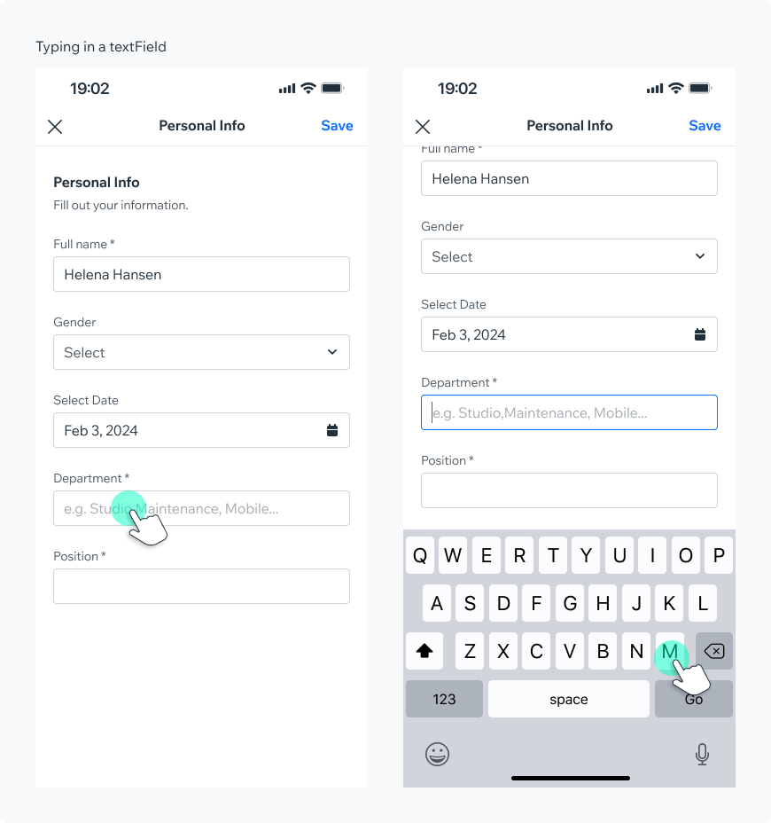
Usage ExamplesText fields are used primarily in forms to allow users to enter text. Text fields are normally found within a form but can also be part of a settings screen or an interactive flow.
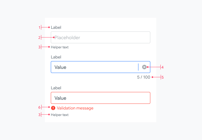
StructureMarkdown:
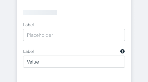
1. **Label**
Describes the information that the user needs to enter. The label should be short and clear, preferably a noun.
2. **Placeholder** (optional)
Placeholders can serve as an assistive text that can provide additional aid or context to the user. Don’t use it to display critical information - as it disappears when the users starts typing.
3. **Helper text** (optional)
Use this to provide a hint or a disclaimer about the content of the field. For example, “Passwords must contain at least 8 characters”
4. **Clear button**
Lets the user to easily clear the input value. Appears only when value was typed.
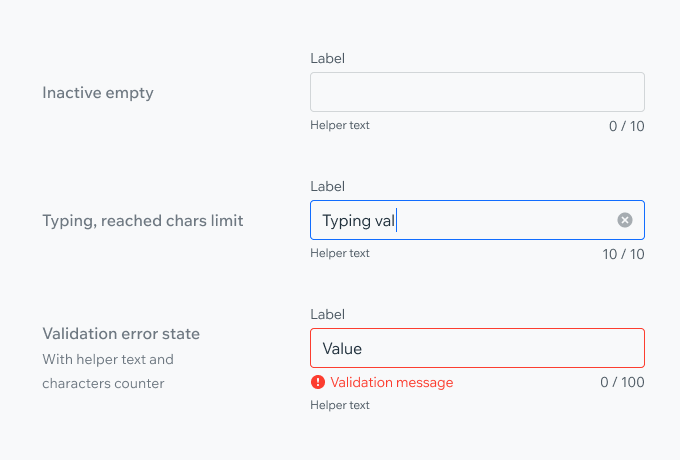
5. **Character count**
Should be used if there is a character limit. Displays the amount of typed characters out of total allowed. If the limit is reached, the counter will become red and further typing is disabled.
6. **Validation message**
Demonstrates that a required input is missing something or the entry was invalid.
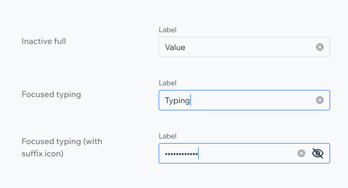
States
| Property | Component |
|---|---|
| Inactive (default) |  |
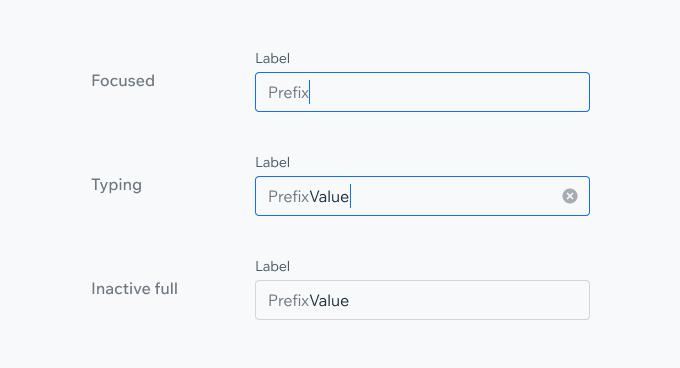
| Focused |  |
| Typing |  |
| Inactive Full |  |
| Validation Full |  |
| Warning (WIP) |  |
| Success Validation |  |
| Disabled |  |
| Read Only |  |
Styles
| Property | Component |
|---|---|
| Outline (Default) |  |
| Underline |  |
| Property | Component |
|---|---|
| Leading Accessory (Prefix) |  |
| Trailing Accessory (Suffix) |  |
| Top Trailing Accessory |  |
| Characters Limit |  |
| Delete Value Icon |  |
SpecMarkdown:
**Label**
bodySmall, $textNeutralHeavy
**Placeholder**
body, $textNeutralLight
**Value**
body, $textDefault
**Helper Text**
subtext, $textNeutralHeavy
**Character Count**
bodySmall, $textNeutralHeavy
**Validation message**
Message - bodySmall, $textDangerLight
Icon - exclamationFillSmall, $iconDangerLight
**Prefix & Suffix**
body, $textNeutral
**Clear Button**
xFlat, $textNeutralLight
**Warning Message**
Message - bodySmall, $textDefault
Icon - exclamationFillSmall, $iconDefault
**Validation Success**
Icon - checkmarkFlatSmall, $iconSuccess
**Outline - Default/unfocused**
1p, $outlineNeutral
**Outline - Focused, typing**
1p, $outlinePrimary
**Outline - Validation**
1p, $outlineDanger
**Outline - Disabled**
1p, $outlineDisabled
**Outline - Read only**
fill background- $backgroundNeutralLight
Props Usage
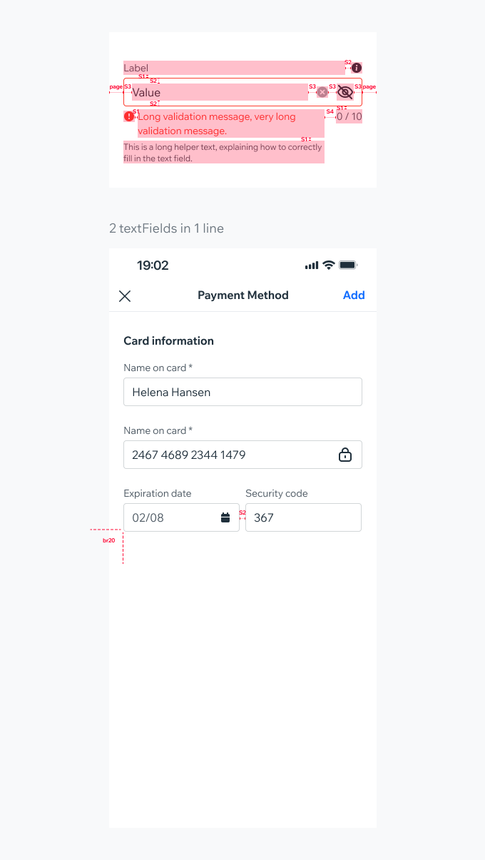
Leading Accessory (Prefix)Use a leading accessory to display pre-defined value before users input. For example presenting a currency before an entered price.
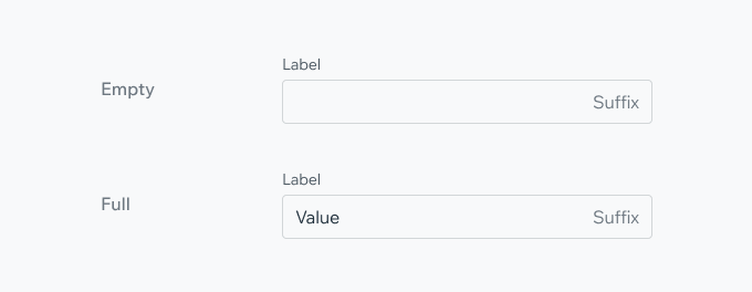
Trailing Accessory (Suffix) - TextUse text as the trailing accessory to indicate the type of value represented by the input. For instance: "Kg.", "Lbs.", ".com".
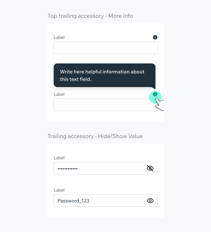
Trailing Accessory (Suffix) - IconUse an icon as the trailing accessory to help users understand or access extra features related to the input.The icon can be placed either in line with the label (top trailing accessory), or as part of the input field.
Include an information icon for users to access additional details about the required input. When clicked, the icon can activate a Hint component for brief information or a Dialog for more detailed explanations.
Icon suffix can be used to toggle between 2 states, e.g. hiding/showing the input value. Or to indicate a success validation state.
Characters LimitDisplay character counter if there is a character limit. If the limit is reached, the counter will become red and more typing is disabled.
Delete Value IconDelete icon appears when there’s a value in the field. Pressing the icon should delete the value and enter focused state, to allow the user to enter a new value. If needed, a field suffix icon can be displayed with the delete value icon.
PlaygroundCode Example
INFO
This component support margin, color, typography modifiers.
TIP
This component extends the TextInput props.
APIThis is the list of additional props for the component