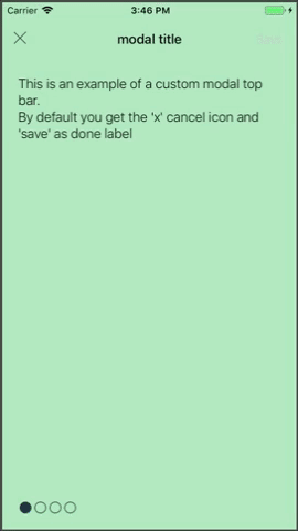
Modal
Component that present content on top of the invoking screen
(code example)
info
This component extends Modal props.
Usage#
<Modal visible={isVisible} onBackgroundPress={() => console.log('background pressed')}> <Text text60>Content</Text></Modal>API#
accessibilityLabel#
Overrides the text that's read by the screen reader when the user interacts with the element.\By default, the label is constructed by traversing all the children and accumulating all the Text nodes separated by space.
string
blurView#
A custom view to use as a BlurView instead of the default one
JSX.Element
enableModalBlur#
iOS only#
Blurs the modal background when transparent
boolean
onBackgroundPress#
allow dismissing a modal when clicking on its background
(event: GestureResponderEvent) => void
overlayBackgroundColor#
The background color of the overlay
string
testID#
The modal's end-to-end test identifier
string
useGestureHandlerRootView#
Android only#
Should add a GestureHandlerRootView
boolean